 Simon Reynolds
Look sharp! Revisiting the graphics of the New Wave era.
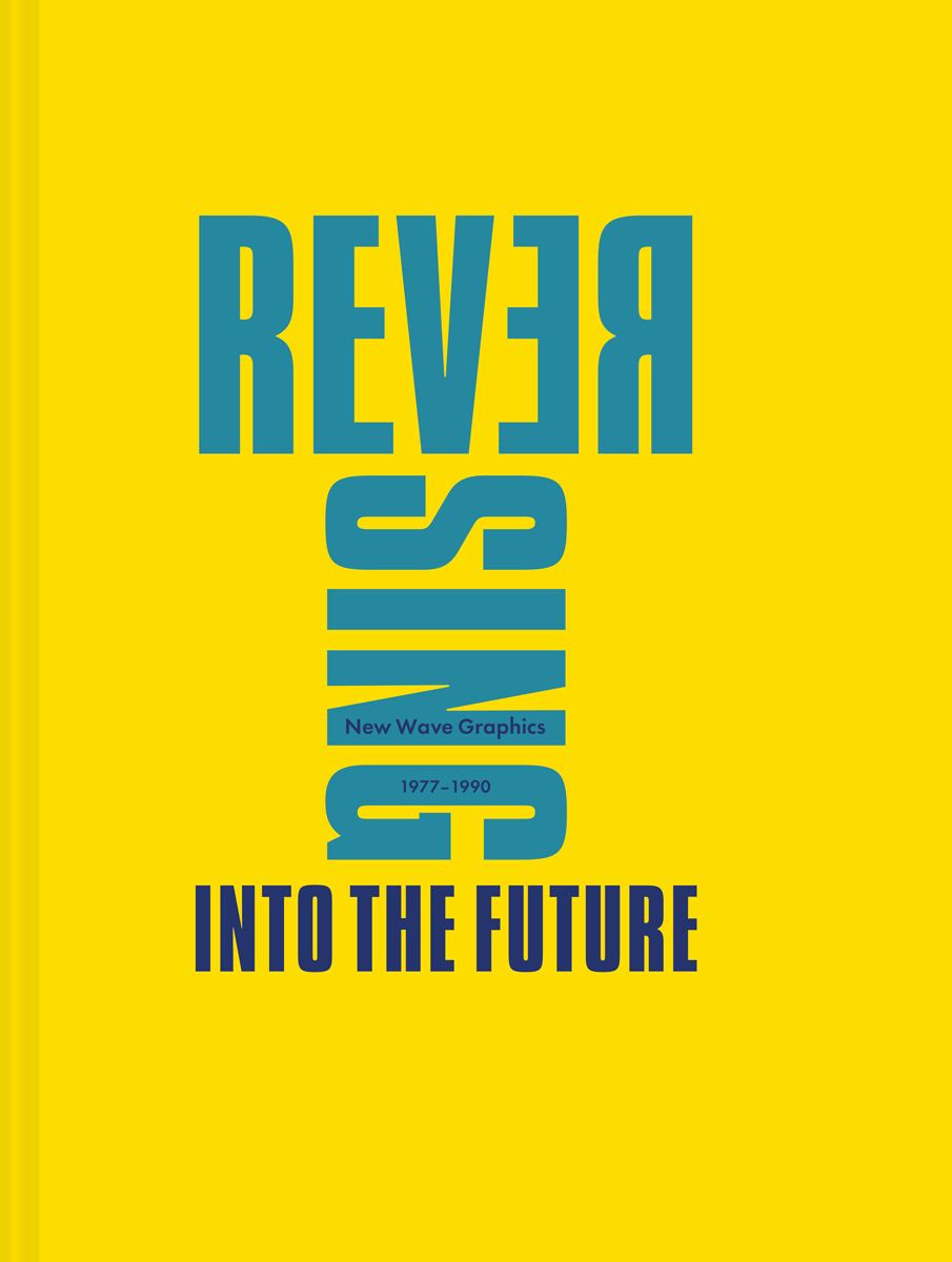
Reversing Into the Future: New Wave Graphics 1977–1990,
by Andrew Krivine, Pavilion, 336 pages, $45
• • •
The term New Wave has largely slipped out of parlance. Young music hipsters today tend to use “postpunk” to talk about what came after and out of punk, or deploy more precise labels to distinguish genres and phases, such as synth pop or power pop. Andrew Krivine, author of Reversing Into the Future: New Wave Graphics 1977–1990, describes it as an “elusive musical category.” Even at its peak of pervasiveness, there was always a vagueness to New Wave (aptly perhaps, given the term’s ancestry in the Nouvelle Vague of French cinema). What it referred to evolved over time and varied in different territories. But if there’s a basic arc, it’s a journey from a positive, open-ended synonym for punk to a narrower and increasingly negative concept evocative of skinny ties and too-tight trousers. Punk purists might have disagreed over whether punk’s essence was prole anger, politicized militancy, nihilism, or simply the impulse to offend, but they all sneered at New Wave as lightweight and play-safe: groups who’d kept the energy and simplicity of punk, but were tuneful and clean-cut enough to clean up on the airwaves and at the record stores. A “sellout” dilution of punk—and some of the archetypal New Wave groups, like Blondie and the Cars, sold very well indeed.
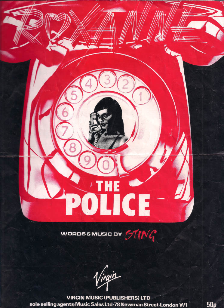
The Police, “Roxanne” 45 sheet music (Virgin Music Ltd, 1978). From Reversing Into the Future: New Wave Graphics 1977–1990, page 256. Courtesy Pavilion.
Initially, the primary purpose of New Wave as a term was that it posited the existence of an Old Wave, an aging and out-of-touch rock establishment. No one ever used “Old Wave,” but “boring old farts” was a common insult aimed at the likes of Pink Floyd and Led Zeppelin. The reality was rather more complicated. Take the Buggles, sonically and graphically as Noo Wave as it gets, and the first group we encounter in Reversing Into the Future. “Video Killed the Radio Star” was the first promo played on MTV. But the group’s Trevor Horn and Geoff Downes briefly joined the prog-rock behemoth Yes, while as a producer Horn applied a modern sheen to “Owner of a Lonely Heart,” resulting in Yes’s biggest-ever hit. Many New Wave artists, from ex-proggers the Police to music-biz veterans Annie Lennox and Dave Stewart of the Tourists and then Eurythmics, had extensive pre-punk pasts. So did some of the key designers: Barney Bubbles, creator of startlingly inventive record covers and witty advertising campaigns for labels like Radar and Stiff and artists like Elvis Costello and Ian Dury, previously crafted a signature look for releases by hairy space-rockers Hawkwind.
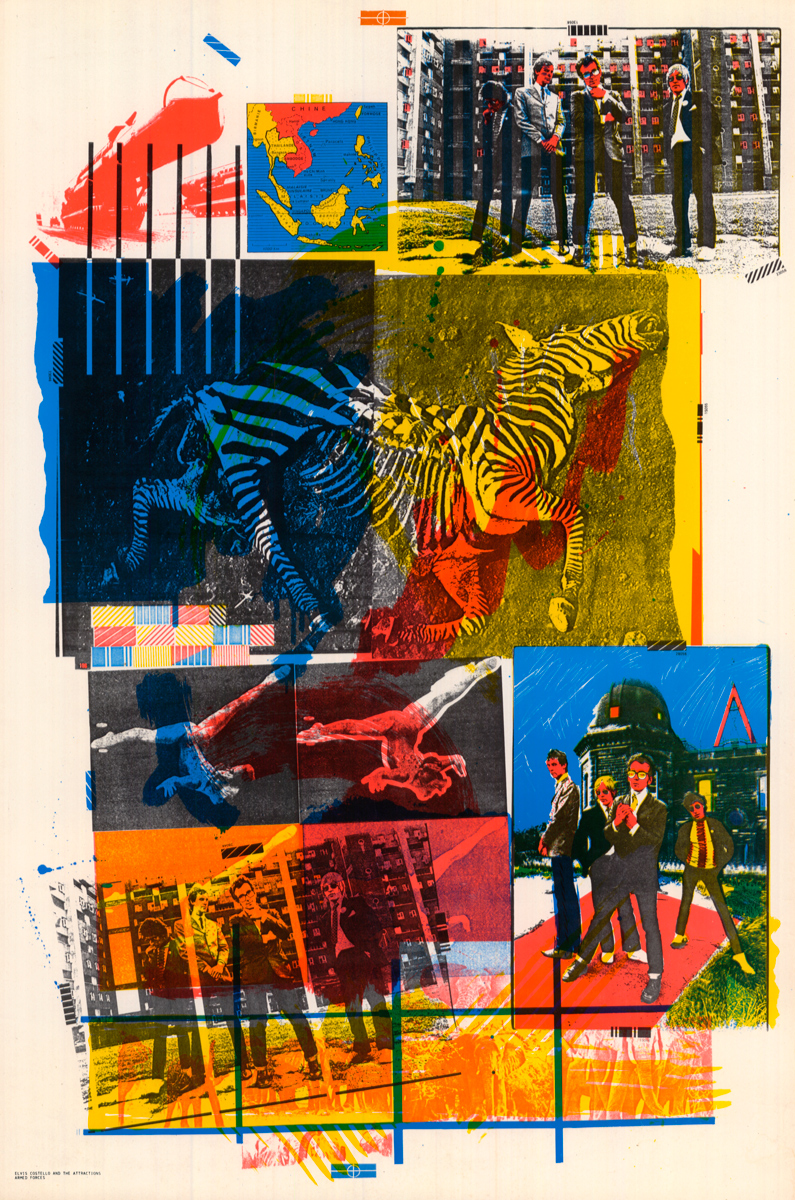
Poster designed by Barney Bubbles, used to promote the American release of Armed Forces, Elvis Costello’s third LP (Columbia Records, 1979). From Reversing Into the Future: New Wave Graphics 1977–1990, page 271. Courtesy Pavilion.
A multitude of artists with wildly various musical ancestries converged as the New Wave. One thing that gave coherence to this motley movement was its visual language: album and single artwork, clothing and hair, gestures and dance moves onstage and in video. Almost instantly, seemingly out of nowhere, modes of presentation and packaging emerged that created the stark sense of new times. Breaks with the early ’70s look of things, these mannerisms quickly became conventions easily if often clumsily adopted by record companies looking to reposition older acts in a changed marketplace. It became a zeitgeist template that wrapped recordings by figures as disparate as NYC street poet Jim Carroll and downtown performance artist Laurie Anderson.
If a single word distills the New Wave aesthetic, it’s plastic. In the 1960s, the p-word had been a hippie pejorative, contemptuously describing everything phony and prefab in contemporary life. New Wavers didn’t entirely disagree with this negative verdict, but they reveled in synthetic modernity. X-Ray Spex singer Poly Styrene, a hippie turned punk, expressed the ambivalence in both her name and songs like “The Day the World Turned Day-Glo” and “Plastic Bag.” From Belgian faux-punk Plastic Bertrand, to Japan’s the Plastics, to the Buggles single “The Plastic Age,” ironically flaunted artificiality became a leitmotif of the era. Visually, this came through in the fad for colored vinyl records in lurid and often fluorescent shades, in the craze for inorganic-looking hair dyes and man-made fabrics, and, in record design, the compulsive (verging on compulsory) use of hot pink and electric yellow.
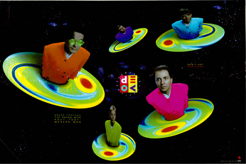
Devo, Smooth Noodle Maps LP (Enigma Records, 1990). From Reversing Into the Future: New Wave Graphics 1977–1990, page 57. Courtesy Pavilion.
A rival to plastic as the era’s hallmark is the geometric. It’s hard to miss the homology between designers like Malcolm Garrett’s uses of stark lines, blocks of primary color in square, triangle, and circle shapes, and grid patterns, and the angularity of New Wave groups like XTC and Devo, with their herky-jerky rhythms, spiky melodies jumping up and down the scale, shrill vocal yelps, and robotic or exuberantly ungainly stage moves. Where Funkadelic’s liberation credo was “dance our way out of our constrictions,” New Wave turned neurosis and non-fluidity into an aesthetic. New Wave was often boppy, but it didn’t swing or pull at your hips; instead dancers opted for choppy, side-to-side hand movements.
Although certain New Wave artists cribbed ideas from disco and reggae, for the most part the genre was defined by its whiteness, in so far as it severed the connection between rock and rhythm and blues. Instead of trying to sound Black, New Wavers sang from a place of authentic inauthenticity, as hollow-souled suburbanites rather than urban hipsters.
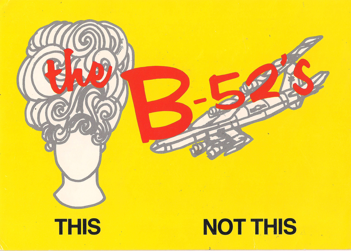
B-52s, promotional postcard (Warner Bros. Records, 1979). From Reversing Into the Future: New Wave Graphics 1977–1990, page 31. Courtesy Pavilion.
Referenced often in song (Martha and the Muffins’ “Suburban Dream,” the Members’ “The Sound of the Suburbs”) and sometimes in band names (Suburban Lawns), the pretty, placid peripheries—where the action wasn’t—were New Wave’s heartland. That’s partly where the plastic fetish comes from, a retro-tinged evocation of the Formica Fifties, the America satirized in both John Waters’s films and the B-52s’ music and image. Reversing Into the Future captures this idea of retro-modernity in its title as well as many of the record sleeves and promotional materials corralled within. Designers ransacked ideas from earlier decades of post-WW2 record packaging and commercial art, mixing and matching elements and epochs. Some, like Peter Saville in his work for Factory and DinDisc, went further back still, recycling innovations in typography from the early twentieth century. A term sometimes used by music journalists around 1979–81 was “moderne”: the extra “e” conveying the sense that this was not really modernist in the avant-garde sense of entering unknown territory, but instead a knowing reference to earlier aesthetics of modernity, imbued with an undecidable blend of affection, sarcasm, nostalgia, and pure envy for the long-gone possibility of doing something truly new.

Split Enz, True Colours LP poster (A&M Records, 1980). From Reversing Into the Future: New Wave Graphics 1977–1990, page 320. Courtesy Pavilion.
Reversing Into the Future features sharp essays from guest contributors like Andrew Blauvelt, Philip Brophy, and Matthew Worley, as well as amusing reminiscences from key designers like Chris Morton. But the book really triumphs as a visual feast, pulling together a mass of album and single covers (including prototypes and alternate versions), tour posters, club flyers, and adverts. If well-known groups like Talking Heads and Devo—both of which contained members who’d studied fine art or design—stand out, there are numerous obscure discoveries, such as the NYC-based zine Non LP B Side, whose staff artfully deployed two-color printing, grids, and newspaper cartoonist tools like “stipple” (blocks of shading cut out of a transfer sheet). Conversely, the eye is fairly frequently affronted by hideously garish artwork that probably doesn’t deserve being salvaged for posterity (Howard Jones, Oingo Boingo, and Split Enz—or rather their designers—being only the most heinous offenders). There’s a slight feeling of mission-creep, the project’s scope sprawling into areas like college rock and eighties alternative, that suggest an earlier cutoff date like 1983 might have usefully focused things. But overall, Reversing is a treat for anyone who lived through the era and likely a revelation for those too young. Be warned, though: this bygone future’s so bright you might need shades to shield you from that pink and yellow glare radiating off the pages.
Simon Reynolds is the author of eight books about pop culture, including Retromania, the postpunk chronicle Rip It Up and Start Again, the techno history Energy Flash, and Shock and Awe: Glam Rock and Its Legacy, from the Seventies to the 21st Century. Born in London, currently resident in Los Angeles, he is a contributor to publications including the Guardian, Pitchfork, and the Wire, and operates a number of blogs centered around the hub Blissblog.